From CSV to GitHub Pages in 5 Steps: Publishing an Interactive Social Network of the Marvel Universe
How to easily create an awesome graph visualization using Python, Gephi, and GitHub Pages
In this article, I will provide a step-by-step guide on how you can create, publish, and share interactive network graph visualizations in 5 simple steps.
Before we get started, here are the three things we need:
- Python & NetworkX library [1]
- Gephi [2] & SigmaExporter package
- GitHub account & a public GitHub repository
Step 1: Import the CSV file and create a NetworkX graph
Our data source really can be any data format (e.g. TSV, pandas data frame, or array), but in this article, we will focus on CSV (Comma-Separated Values) format. In this tutorial, I will use the Marvel Universe Social Network dataset from Kaggle [3] to create an interactive graph of relationships between heroes. The dataset describes co-occurrences of Marvel heroes in comic books, so each row describes an instance in which hero1 (in column 1) appeared in the same comic as hero2 (in column 2).
We start by importing three Python libraries: (1) csv for reading CSV files, (2) tqdm for displaying progress bars (optional), and (3) NetworkX for creating and modifying graphs.
import csv
from tqdm import tqdm
import networkx as nx
We then create an empty NetworkX graph…
import networkx as nx
G = nx.DiGraph()
…and add nodes and edges based on our CSV file. We iterate over each row adding nodes for hero1 (first column) and hero2 (second column). There is no need to worry about adding duplicate nodes, as the name/label serves as unique IDs, and nodes that are already in the graph are skipped. If the edge from hero1 to hero2 does not exist in our graph yet, we add it and set its weight value to 1 (meaning they appeared together in a comic book once). If the edge already exists we just increment the existing edge’s weight by one.
with open('./data/hero-network.csv', 'r') as f:
    data = csv.reader(f)
    headers = next(data)
    for row in tqdm(data):
        G.add_node(row[0]) #superhero in first column
        G.add_node(row[1]) #superhero in second column
        if G.has_edge(row[0], row[1]):
            # edge already exists, increase weight by one
            G[row[0]][row[1]]['weight'] += 1
        else:
            # add new edge with weight 1
            G.add_edge(row[0], row[1], weight = 1)
In order to receive first information on our graph, we print out its node and edge count.
G_nodes = G.number_of_nodes()
G_edges = G.number_of_edges()
print("Nodes = ", G_nodes, " Edges = ",G_edges)
In total, our graph has 6,426 nodes and 224,181 edges.
Step 2: Export the NetworkX graph as gexf file
In the next step, we convert the NetworkX graph to a gexf file (Graph Exchange XML Format) and store it in our file directory.
nx.write_gexf(G, "./data/hero-network.gexf")Step 3: Import and modify the graph in Gephi
As our graph is stored as a gexf file, we can import, modify, and visualize it using the open-source application Gephi (available for Windows, MacOS, and Linux), which offers a variety of functionalities.
First, we import our gexf file as undirected graph and install the SigmaExporter JS package (Tools > Plugins > Available Plugins) to leverage Sigma JS [4]. If you want, you can choose to install and use additional layout algorithms as well.
In the next step, we want to make more relevant nodes (e.g., Tony Stark, Captain America) that are well-connected appear larger. For this we calculate the average weighted degree in the statistics tab (for directed graphs I can recommend using PageRank), and set the node sizes accordingly in the appearance tab, with 8 being the minimum and 48 being the maximum node size.
Finally, we run a modularity algorithm [5] to cluster our graph and assign nodes to a module. We then assign our node colors based on module affiliation and run a graph layout algorithm of our choice (in our case Force Atlas 2). Keep in mind that Gephi provides a variety of ways to personalize our graph [6].
Step 4: Export the graph as Sigma JS
If we like the layout and visualization of the graph, we can now export it as a Sigma JS template (File > Export > Sigma JS template). Gephi will ask us to provide some basic information on the graph (e.g., title, author, legend, and descriptions). I would recommend to check the search option, as it will enable looking up nodes in the final graph visualization. In addition, setting the hover behavior to dim provides an improved interactive experience. Finally, we select the target directory and click export. We should now have a network folder in the target directory.
Step 5: Publish the graph visualization on GitHub pages
We can test our graph locally by opening navigating to the network folder and opening a Python http server with the following command.
python -m http.serverpython -m SimpleHTTPServer (for earlier Python versions)
We should now be able to see our graph in our web browser at the URL: http://localhost:8000/. However, if we want to publish our graph online and share the link with others, we can do so by leveraging GitHub Pages. First, we create a new (public) GitHub Repository and upload the network folder. We then go to our repository settings and select the GitHub Pages tab. Once there, we set the main branch as our source. The graph should now be available at the following URL:
https://[YourGitHubName].github.io/[YourRepositoryName]/network/We can now explore the graph by selecting and searching nodes. In addition, we can further adjust the graph’s visuals [7].
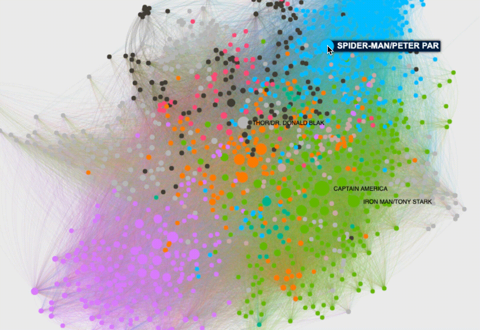
Here you can find the final Marvel Universe Co-Occurrence Network hosted by GitHub Pages.
If you want to create your very own network visualization, check out my GitHub Repository containing the Jupyter Notebook script.
References:
[1] NetworkX, Homepage (2021)
[2] Gephi, Homepage (2021)
[3] C. Sanhueza, The Marvel Universe Social Network (2017)
[4] Sigma JS, Homepage (2021)
[5] Parklize, Gephi - Clustering layout by modularity (2014)
[6] K. Cherven, Mastering Gephi Network Visualization (2015)
[7] Sigma JS, Documentation (2021)

